
|
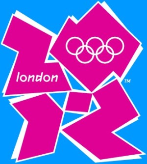
"The vision at the heart of our brand", no less, apparently, although quite what that vacuous collection of snappy buzzwords actually means is anyone's guess. But that logo will now become in the touchstone of this particular brand. It is supposed to enthuse, attract and inspire people to participate or take an interest in the games. And yes, it is awful.
It intrigues me, how anyone could come up with something which is so spectacularly off-target, so ultimately meaningless, so lacking in a nexus to its subject. And it isn't just the ordinary lay man like yours truly who is perplexed, but those involved in the industry too. It restored my faith just a little when the advertising executive with whom I was talking was asking the same questions: how, and why?
Her opinion was interesting, because she has some experience in developing these things. For her, a brand is about recognition: if you have something on the table already, then you should exploit it. You shouldn't ditch an established and instantly recognisable brand in an attempt to make something snappy or exciting or for short term impact. That was her chief criticism: that the Olympic symbol is there, known to people of all backgrounds across the world and this country, and yet it has been cast aside under the misguided notion that newer is somehow, automatically, better. And, as the conversation went on, that brought me to football, and then specifically to Burnley.
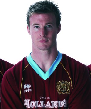
What exactly represents the Burnley brand? Not, I don't think, the club crest - although obviously it has importance. I think it is the club shirt, the style and the colours that it contains. It should, therefore, be a shirt of claret and blue.
We relaunched our brand last week, as we do every year these days. And let me say that it is a good looking shirt: a little bit retro, classical even, in design. I even quite like the gold badge. But it isn't, to me, how a Burnley shirt should look. It is a claret kit, with a bit of gold, and blue edging. I know we have played in a similar shirt before, for a period in the early 70's. But in my mind, a Burnley shirt has a claret body, and blue sleeves.
That is our brand, it is what we are about. It is how I daresay any of the football directories would instinctively describe our colours, and if you asked most supporters to describe a typical Burnley shirt, that would be their response. So why do we mess about with it so much? Why don't we buy into that heritage, that instantly recognisable symbol of our club?
|
Do we change the composition of the shirt annually to increase sales? Perhaps, but it isn't the only way to do that; if it was, then someone would have swiftly added an additional splash of colour to the Manchester United shirt, or to the Liverpool strip. Funnily enough, these clubs have only one club colour, and it doesn't seem to have too much effect on their revenues.
They still change their shirt each year - indeed, all three of their shirts, and which club doesn't? - but through more subtle alterations which do not involve changing the basic image in the slightest. And in any event, whatever the short-term benefits of changing the shirt, it strikes me that there is a downside to constantly meddling with something as entrenched in people's perception as a football shirt.
As my friend the advertiser said: "You don't mess around too much with a brand if it is already established. With a sports shirt, you might alter the cut, the fabric, or the sponsor's logo, the position of the badge or things like that. But you only make more substantial change it if the brand is failing, and you certainly shouldn't change it every year."
And playing about with the claret and blue of Burnley is a substantial change. "Think of a national flag as the worldwide brand of a country. The French has three colours - blue, white and red - in vertical stripes. You change the sequence, and you have a new brand. Even if you make the stripes horizontal, you have a new brand completely unrelated to France. In fact, you have the national flag of the Netherlands. The same principle must apply to football shirts."
We want kids to see a Burnley shirt and identify with it; the more constant it is, the more likely those potential fans are to make this leap. In the towns and boroughs which the club must be targeting, the ones surrounding Turf Moor, that classic kit we have worn for the lions share of our history is simply the most recognisable as an advert for the club. Somehow, the variations don't work as well.
And aside from all these modern, marketing reasons for simplicity, there is a greater, and more important reason. Burnley Football Club should be proud of itself, of its history and of its associations. There is a reason why we have played for so long in a claret shirt with blue sleeves: because it looks good. It was never, ever, broken, so why on earth should we constantly try and fix it?